Colors in every way are believed to affect the mood and behavior of a person. An individual’s nature is often said to have changed or influenced based on the kind of colors he is surrounded with. Light and pale are the best colors for interior paint which often bring freshness and brightness in a particular space. Whereas dark colors even while showcasing bold ambiance, are said to dampen the mood.
Since the year 2018, pastel colors have been quite a much in trend. There have been websites, branding schemes, fashion, social media, and interior décor, acknowledging the pastel scheme for various products.
But what exactly defines color as pastel? Simplistically, any color when mixed with white, making it subtle and pale, while sustaining its original shade is termed as a pastel color.
It is extremely important to pair a pastel color with a corresponding darker hue, in order to balance the visual flow. A single pastel hue alone can lack visual impact because of its desaturation. You can opt these as wall colors or add as accessories to the focal points in the space.
With the historical origins, symbology and psychology of pastel colors, there are different ways to use these interesting interior paint colors for your homes. So, what are the new interior colors for 2020? Keep reading.
1. Brown & Yellow
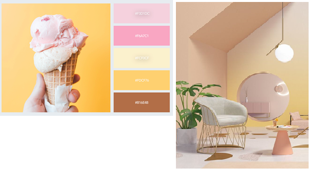
Traditionally associated with femininity and motherhood, you can use pastel colors to decorate the bedrooms of young children. Pastels’ youthful tendencies extend to associations with frivolity, joy, optimism, and lightness. However, pastels are not always exclusively associated with the female gender. Their preppy origins when combined with browns & yellows can showcase a bold & sporty look, while being subtle altogether.
2. Blue & Wheat
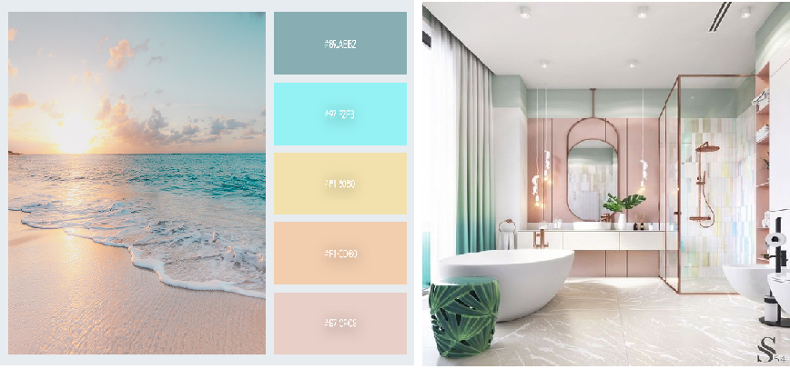
A few years ago, using pastels for bathrooms was not a sought after option. Neutral bathrooms often meant statuario marble can pair with wooden finishes. Today, pastels continue to be a go-to color choice for designers looking to seduce consumers with promises of spacious ambiance, European glamor, and frivolity.
3. Peach & Purple
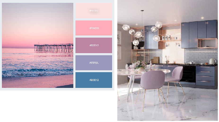
Combining muted pastels with edgier black creates a high-contrast palette that is reminiscent of the 1980s design styles. Using a dark pastel color as the dominant shade can be a little challenging when it comes to balancing the space with a corresponding opposite. The shade card shown above depicts beautifully, how deep and subtle purples you can combine with light peach and skin tones.
4. Green, Blue, & White
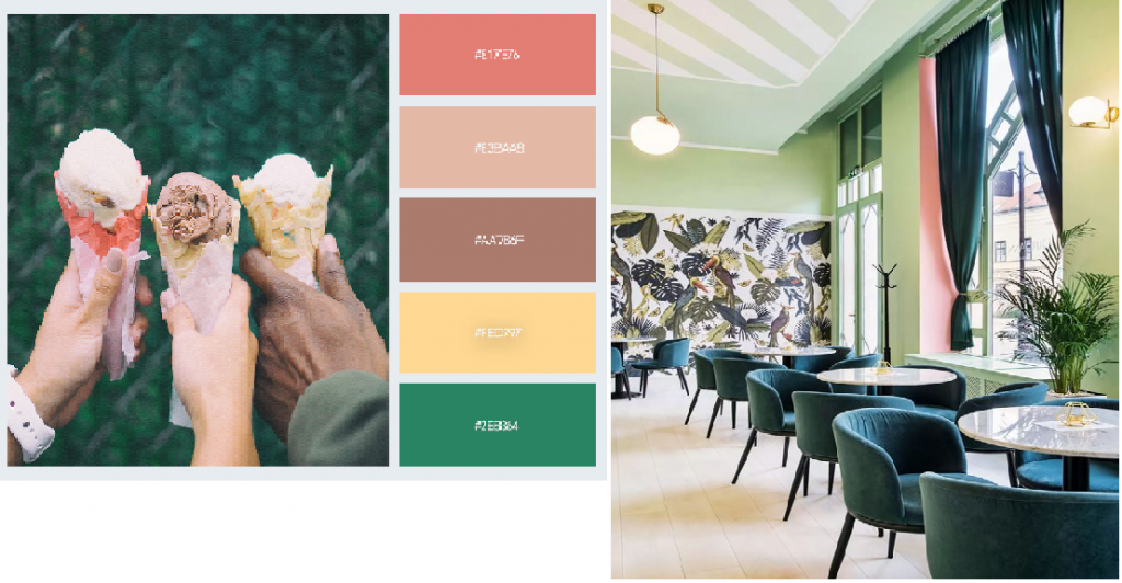
Pastels really come into their own while using collectively. This is a sure-fire way to channel a summery or vintage vibe in your interior designs. Because of their subdued hue, you can treat pastels with more versatility than their brighter relations. Combining two or more pastel colors together doesn’t result in the potential eyesore that more vivid tones might be achieved. Combining green, blue, and white, this peaceful and fresh pastel hue is championed for its ability to impart calm and serenity to space.
5. Cobalt Blue & Maroon
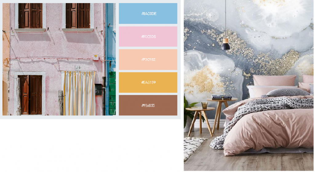
A small dose of pastel color paired with a richer hue, such as cobalt blue or maroon, is useful for lightening the mood of what might otherwise be a somber scheme. A striking balance between frivolous pastels, vivid brights & darker hues can be achieved with this color palette. The ethereal beauty of pastels is enhanced with delicate metallic accents. The wallpaper here has a metallic tinge, which enhances the pastel shade more effectively.
6. Blues & Greens
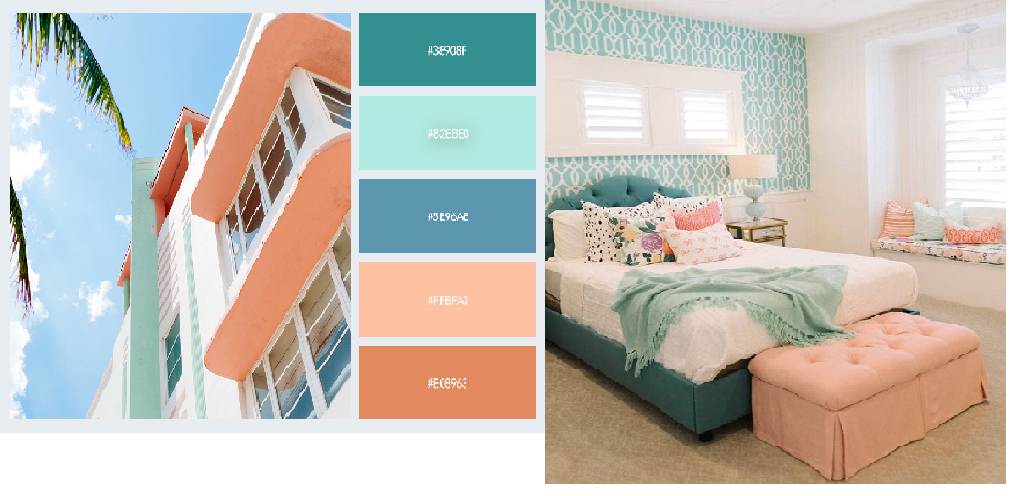
Looking for a sophisticated way to use pastel colors? Navy is perennially chic and helps to anchor breezy mint and pastel blue. This is an elegant and grown-up scheme for the interior and stationery design. Typically classified as the girlish colors, peach hues often get segregated for being used in the bedrooms. Paired with beautiful blues & greens, a very appealing bohemian theme can be achieved.
You can choose one of the above-listed combos which will pair well with your interiors. Pastel colors are especially soothing and it will give a soft and unsophisticated feeling. Without a doubt, it’s the color of the year 2020. Make sure to choose the furniture that matches the best interior paint colors.
If you have any interesting color combinations, let us know in the comments section.