Good Design is s renaissance attitude that combines technology, cognitive science, human need & beauty, to produce something that the world didn’t know it was missing. – Paula Antonelli
A style guide complementing the architectural scheme while creating coherent design system, defines a design language. The combination of focal points, colours, balance in pattern, movement & shape together confine a complete design scheme. Aesthetic coding revolves around balancing the various aspects completing the jig-saw puzzle.
For a space to be termed as aesthetically balanced, a lot of factors need to be considered. The colour palette, the light balance, the furniture placement & the furnishing. The principles of design need to be optimised in order to create something aesthetically pleasing
The key elements, that play a major role in experiencing aesthetics are –
- Scale & Proportion
- Cognitive Engagement
- Colour & Contrast
- Visual Weight
More often than usual, the viewers become judgemental on visiting a space about the ambience & the visual feature of the place. However, the design is often synced with the colours, furniture, lighting & the movement distribution to create a warm & pleasant vibe.
1. Scale & Proportion
Proportion & scale revolve around fitting & balancing the design pieces into a particular space. Proportion emphasises on the pieces viz. furniture & décor fitting together, whereas scale refers to fitting the pieces in a space. The elaboration can seem to be quite mathematical, but in reality, the human eye can easily identify items kept out of place.
When it comes to scale & proportion, the focus is on following the Golden Ratio & not the Golden Rule! While the ratio often emphasises on breaking things equally, design requires approaching the space in either one-third or two-third sections.
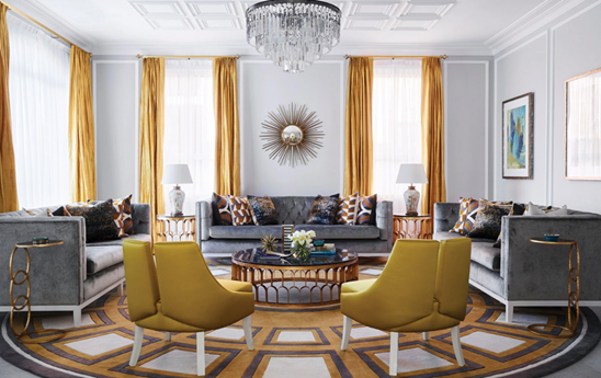
Image source: Covet House 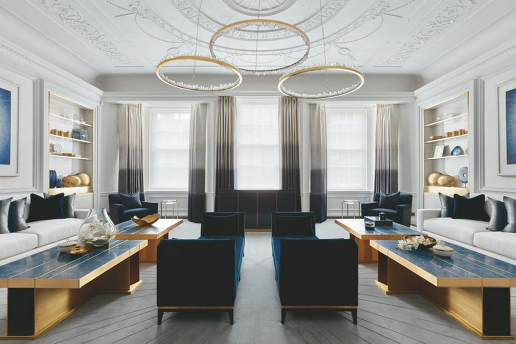
Image source: Covet House
The spaces above show a visual balance in colours as well as shapes. There has to be a harmony with the colour schemes, with décor items adding some spice & breaking the patterns.
2. Cognitive Engagement
One of the biggest challenges that designers face, is to better understand how vision, perception & emotions can be synchronised in the space. Our key insights may revolve around the mental & emotional experience a person has while coming into enclosed spaces, observing certain shapes & structures or integrating coherence & meaning to the space. However, the simple trick to achieve this can relate to a basic concept about pushing the brain into doing something that it loves. This implies applying the principles of psychology to build the environment around us.
Spaces change over time, and so do our attitudes towards them. Just as music or emotions, design also has the ability to influence moods. This can be achieved majorly through lights & patterns.
Image source: light cognitive 
Image source: Arch Daily
The ambience is a combination of subtle lighting with sheer fabric & minimalistic furniture. The colour palette is neutral to soothe the eyes & relax the brain. While the colour pattern continues to be minimal & neutral, there is an addition of heavy pattern. This allows the brain to work on the visual & mental balance while relaxing & enjoying the ambience.
3. Colour & Contrast
Interior design buffs on the importance of spaces making first impressions. Its amusing how a space can catch your breath in spite of having visually striking elements, whereas some fall flat even when they have all the elements in correct compilation. The secret ingredient for achieving the striking balance is the contrast. While it often revolves around having maintained considering colours, the textures also play a vital role in having a space defined well in terms of contrast.
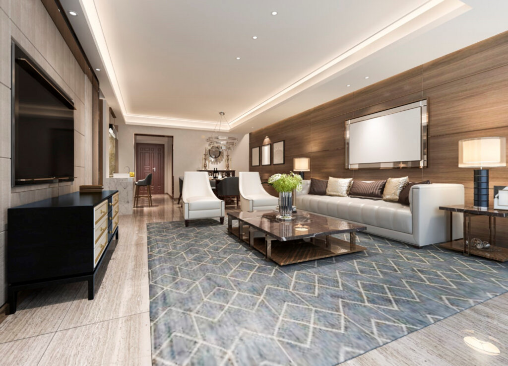
Image source: Pinterest 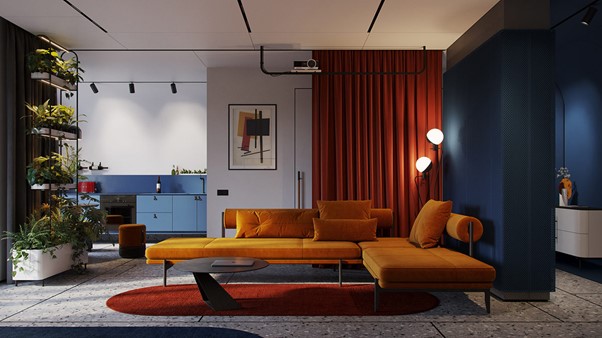
Image source: Pinterest
Texture often refers to the way we perceive the design elements. The tactile as well as the visual feature for the textures, contribute towards the visual weight & balance of a space. As the name goes, the pairing for textures can go with a combination of having rough-skinned tiles above a sleek furnished console.
The difference in luminance does not always refer to the terms of lights, it also varies as per the combination of colours in a particular space. The contrast can either be achieved while following the colour schemes, or by simply combining shades of dark & light colours while changing the luminance.
4. Visual Weight
Visual weight relates to the way an object or an element reacts or interacts with your eye. The purpose of visual weight is to define and balance, how an individual is going to perceive the space. The factors that come into consideration for the same could be balance & proportion, colour & texture, luminance and size. The designer usually needs to be quite intuitive about how the users will decipher the characteristics of these elements, as these concepts are subjective in nature. Along with the basic factors, the additional elements that require consideration are –
a. Grounding – Items that are placed on the ground appear more heavier as compared to the ones that are placed on elevated level. This is due to the light regulation around the object.
b. Proximity – A larger looking object can be illusioned on appearing lighter but placing it around various other objects. The could be identical or contrast, depending on the theme of the ambience.
c. Texture – Texture that adds a lot of shadow, or the one with deeper hues can seem heavier. For eg. Curtains with a velvet texture or darker colour appears heavy as compared to the light sheer curtains.
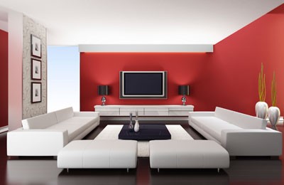
One way of having a steady visual weight is by maintaining symmetrical balance. This can depend upon factors like share, size & colour. In the above example, even though red is dominant as a colour, the furniture draws attention and softens the whole experience.
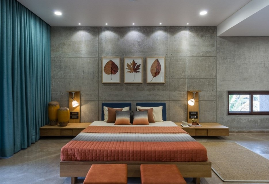
Adding definite elements with respect to shape & size, can also contribute to achieving visual chemistry between the objects. Another factor that need careful attention, is the colour scheme. The above picture has contrasting colours, and a steady placement of linear shapes. The overall combination with a neutral shade on dominance contributes for balancing the overall ambience.